

Create a Instant noodles cup direct mail which having my signature curly hair and also my illustration style.
The idea of using noodles cup is because instant noodles is always a designer’s best friend when burning midnight oil. Most of the designer also need it as it reflect that I am the one every company needs. Instant noodles also come will a fast serving and good taste which represent that I am having fast-learning speed and good taste in design.
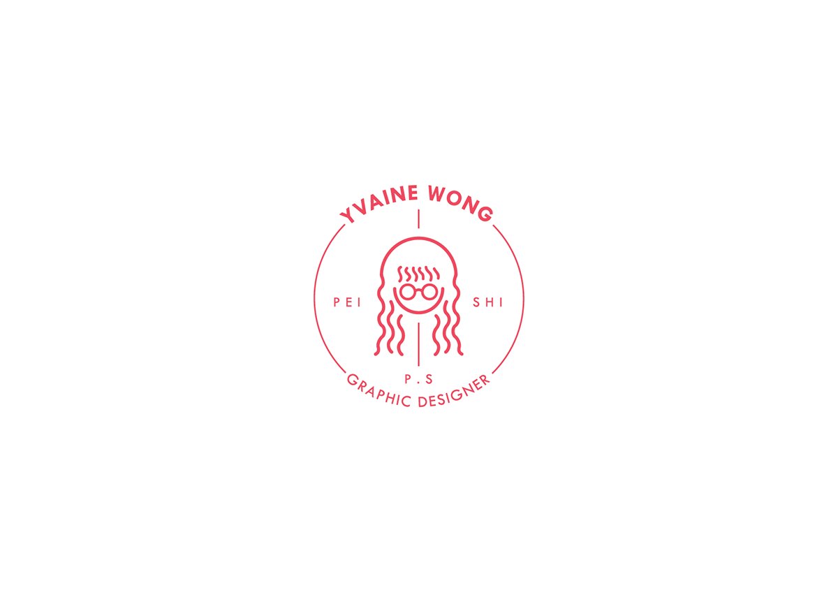
ABOUT MY LOGO DESIGN
The self logo features a head of myself in a line stroke design which is one of my favourite art style. There is also my characteristics in the logo which is my curly hair and my round glasses. There are also 3 versions of my name which can be call any one of it.

COLOUR PALETTE
The colours that I used in the design are dark pink, nary blue, light blue, light orange, yellow.
The dark pink is my primary colour.
The dark pink is my primary colour.

TYPOGRAPHY

DESIGN STYLE
The design style that I used is design style that I am most comfortable which is combination of line and brush stroke with vector illustration.

DESIGN ELEMENTS
Design elements are designed with a line stroke design which is instant noodles. The whole design is combination with line, shape and brush stroke to brings out my personalities - joy and positive attitude and colours also can boost up the
audience appetite.
audience appetite.

MY PACKAGING CONCEPT
Instant noodles packaging include a label design, namecard and portfolio which
audiences can view part of my design works and have my contact information. There is also a QR code which is link to my Behance profile when it scanned.
audiences can view part of my design works and have my contact information. There is also a QR code which is link to my Behance profile when it scanned.
THE FOIL LABEL COVER
The label on top features my logo and some quotes and information align side of the logo.


THE LABEL DESIGN
The label design features design elements with a line stroke design such as instant noodles. The ovarall design is fullfilled with line, shape and brush stroke to brings out my personalities - joy and positive attitude. It can also boost up the audience appetite. The label have mentioned a nutrition information that can tell ‘ingredients’ inside in the cup which is namecard and foldable portfolio. There is also a QR code which is link to my Behance profile when it scanned. I also designed a small information about me on the label which is skills, interests, personalities. It can let the audience know about me.


NAMECARD
The shape of the namecard is circle to match my logo design. It also added the instant noodles element to enhance the characteristics of me. The contact information which is name, contact number, email and Behance link aligned center on the namcard and there is also a QR code link to my Behance profile.


FOLDABLE PORTFOLIO
The size of the foldable portfolio is A3 size. It can be folded 4 x 5 and transform into a small piece of paper that can put into the noodles cup. The flow arragement of the content is clockwise. The audience can read easily according the flow of the clockwise. The content inside contains some part of the design works and it is also have a call to action. Employers can reach me by the contact information if interested on my project.


